 These two photos are my retaken images for my music magazine. I am more likely to use the image on the right as it is direct address and is a more professional image. Both images are unedited and this will be fixed with Photoshop to give them a better look. Both were taken with an iPhone 4 and the quality is somewhat lost, but still retain a sharp image quality compared to the original images I took.
I have decided to do an independent blog post based around the Top 100 clubs as voted for by readers of DJ magazine. This contains the most well known and arguably best clubs and reviews of most of them. These reviews often give insight into the club scene, a very important part of dance music culture and its popularity and these can help give me ideas for creating my double page spread, the next part of my music magazine.
This can be found here
I have decided to do an independent blog post based around the Top 100 DJ's as voted for by readers of DJ magazine. This contains the most well known and arguably best DJ's and interviews with most of them. These interviews often give insight into the mind of a music producer and can help give me ideas for creating my double page spread, the next part of my music magazine. This can be found here
I have decided to use these three images as my main images for my magazine, though I am still unsure how or to what degree i will edit them on photoshop. All 3 have different connotation and reinforce different aspects of my chosen genre, so editing is likely to not be as additive as my original designs.

-Location: School car park
-People: Liam Roach
-Equipment: iPhone 4 camera
-Issues: Image quality, don't have control over background, weather, timing
-Result: Not the perfect image but still very much usable and still very good quality. Will adapt magazine to fit the image.
-Location: Nightclub
-People: John Burke, Kieran Riley
-Equipment: Samsung Galaxy S3 camera
-Issues: Image quality could be poor due to location and lighting
-Result: Turned out well, intended image achieved, very useful.
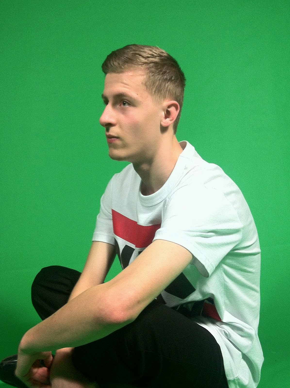
 Front Cover shoot:
-Location: Green Room
Front Cover shoot:
-Location: Green Room
-People: Lewis Webster
-Equipment: iPhone 4 camera, lights, green screen
-Issues: Image quality could be poor due to camera type/lighting, battery may run out
-Result: Turned out well, got desired image, quality is good though could obviously be better
 There are some major differences between the actual magazine on the left and my own creation on the right. The most prominent is the lack of a secondary image on the Mixmag cover and the plethora of writing on the right. Both the masthead and artist name stand out and are much more prominent and visible as opposed to my own, and both are almost directly in the middle. The artist on Mixmag also covers part of the masthead due to the size of the image and profile used, mine however, does not due to the style and nature of how I took the image. Finally, another clear difference is the much increased level of photoshop. The photoshop is of a very complex degree and is additive to the image, whereas mine is much more simplistic and more complementary to my image. My next primary image will likely be of the same person in a more calmer close up wearing costumes and the background will likely be a black haze to give contrast to the image
These are all things i intend to correct when creating my magazine for the final time, and I am well prepared for this task.
There are some major differences between the actual magazine on the left and my own creation on the right. The most prominent is the lack of a secondary image on the Mixmag cover and the plethora of writing on the right. Both the masthead and artist name stand out and are much more prominent and visible as opposed to my own, and both are almost directly in the middle. The artist on Mixmag also covers part of the masthead due to the size of the image and profile used, mine however, does not due to the style and nature of how I took the image. Finally, another clear difference is the much increased level of photoshop. The photoshop is of a very complex degree and is additive to the image, whereas mine is much more simplistic and more complementary to my image. My next primary image will likely be of the same person in a more calmer close up wearing costumes and the background will likely be a black haze to give contrast to the image
These are all things i intend to correct when creating my magazine for the final time, and I am well prepared for this task.
This is my completed first draft of my music magazine. it has a red house style with blue text for the artist, making this part stand out. there is one secondary image that is very much conventional of music magazines in this genre.
There are white cover lines that stand out from the background and help provide a contrast to the aforementioned red house style. It has a large masthead that is easily recognisable for this genre and the primary image stands out amongst the cover.
However, the lack of any real background obviously detaches from the main ideals and otherwise fairly good standard of a first draft. I believe I have followed the genre conventions and only now, for my final magazine, need to improve the quality and photoshopping of the main image.


.jpg)
