


 My double page spread is consistent with magazines in my chosen genre once more, as it has the left hand side dominated by the image, with an article title used as well. i felt this grabbed the attention of my audience and believed it worked well in other magazines from my genre. i also felt having a quote gave an authentic touch to my article, so decided to use that as my own added flair.
  My contents page is similarly inspired by a magazine from my chosen genre, with the idea being simple, informative, succinct and easy to read. I feel as though this helps my magazine stand apart from its influences and isolates the magazine in a positive way. it has 3 pictures, the same number and nearly the same location as the Mixmag equivalent. I felt Mixmag's approach worked and decided against tweaking it to my own tastes as it seemed to work effectively. The only adjustment i made came in the form of an editors note and picture, something I have seen featured many times in other music magazines, and something i believe works in giving a personal touch to the magazine.


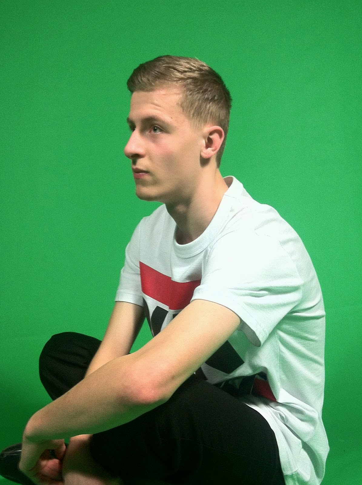
 My front cover takes a minimalist approach to set composure, as I believe overcrowding a set detaches from the original appeal of a magazine, and a convoluted front cover defeats the ideology behind my magazine. As a result, I have used a medium shot that only employs 1 item of clothing; a white 'Run DnB' t-shirt that links with my magazine as DnB stands for Drum 'n Bass, a genre central to my magazine.


 Front Cover shoot:

.jpg)


